EXPERIMENTINTERACTIVE PROTOTYPEJUL 2026
Building Product Sprint
How an over-scoped “Ship It” prototype became a focused pixel-art runner about surviving product chaos—and used 82% of my Cursor model allowance along the way.
Overview
Product Sprint is a one-button endless runner inspired by the mechanical simplicity of the Chrome Dinosaur game.
Instead of jumping over cacti, a pixel-art product manager runs through an endless product-development landscape and avoids hazards such as Tech Debt, Scope Creep, P0 Requests, Bad Managers, Low Tokens, and the occasional meeting that should have been an email.
The final game includes a responsive gameplay surface, five character states, a themed obstacle system, light and dark environments, increasing difficulty, persistent scores, and a leaderboard.
The finished experience is intentionally simple. Getting there was not.
Product Sprint began as a broader game concept called Ship It. That version tried to solve character design, animation, customization, environments, game mechanics, leaderboard persistence, responsive behaviour, and visual storytelling at the same time.
The game became a useful reminder that prototyping faster does not eliminate the need to make product decisions. It often makes those decisions arrive sooner.
From Ship It to Product Sprint
Ship It
Small game surface
Too many systems at once
Product Sprint
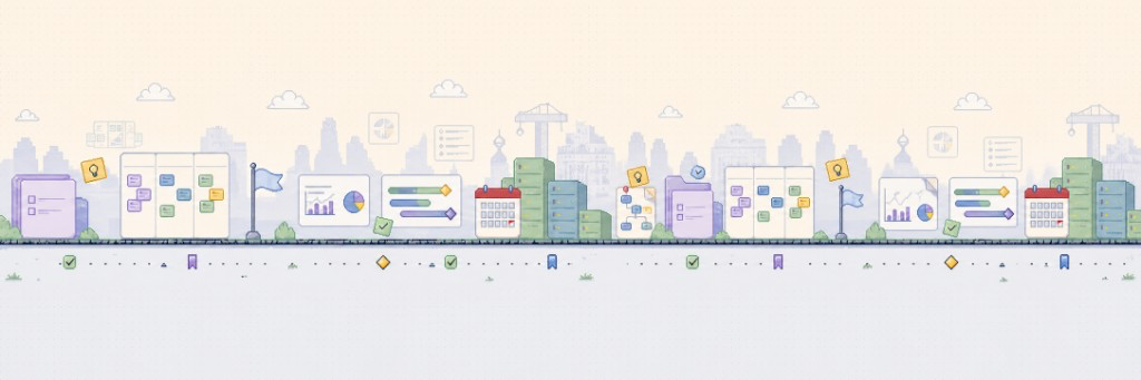

One clear loop, one visual system
Product Sprint gameplay preview with runner animation and tech debt obstacle. Reduced motion shows the static background only.
The original idea
The initial concept was straightforward:
Rebuild the Chrome Dinosaur game for product people.
The player would be a product manager navigating workplace hazards. Every obstacle would turn an abstract product problem into something physical:
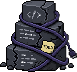
- Tech Debt became a tangled pile of code.
- Scope Creep became a task card growing extra sticky notes.
- A P0 Request became a flashing emergency ticket.
- Low Tokens became an almost-empty meter.
- Bad Manager became an oversized office chair asking for a “quick sync.”
The humour worked, and the one-button game loop was familiar enough that it required almost no explanation.
The first version, Ship It, expanded well beyond that core. I explored multiple backgrounds, detailed vector characters, outfit customization, animated obstacle states, a persistent leaderboard, and increasingly elaborate page layouts.
Each addition sounded reasonable in isolation. Together, they created a game without a stable visual or technical foundation.
Why Ship It stalled
The earliest problem was not the game loop. It was the number of unresolved systems surrounding it.
The artwork was too detailed for gameplay
The original obstacle concepts looked good as standalone illustrations, but they were closer to editorial posters than fast-moving game assets.
At actual gameplay size, small labels disappeared, secondary jokes became visual noise, obstacles had similar rectangular silhouettes, collision boundaries were difficult to understand, and the character looked disconnected from the environment.
A player should recognize an obstacle in a fraction of a second. The first designs required closer inspection.
The character states were inconsistent
Generating idle, running, jumping, and game-over poses independently created subtle differences in head size, body proportions, ground alignment, messenger-bag placement, limb position, and transparent padding.
Each image looked acceptable on its own. Alternating them rapidly created visible jitter.
The problem was not “make a better image.” It was “define an animation contract.”
The page layout treated the game like supporting content
The initial desktop page placed controls on the left, the game in the centre, and the leaderboard on the right. That made the playable surface narrower on large screens than on smaller ones.
The page had more room, but the game received less of it.
Cursor was being asked to make design decisions
Broad prompts such as “make it modern,” “create a polished sprite,” or “make the background more cohesive” left too much room for interpretation.
Cursor was effective when implementing a defined system. It was much less reliable when simultaneously deciding the art direction, asset proportions, animation model, collision geometry, responsive rules, and component architecture.
I was using an implementation tool to repeatedly answer unresolved product and design questions.
The pivot
The pivot from Ship It to Product Sprint was not primarily a rename. It was a reduction in ambiguity.
I reset the project around five constraints.
1.Preserve the one-button loop
The game would remain mechanically simple: run automatically, jump with Space, Arrow Up, W, click, or tap, avoid obstacles, increase speed over time, and submit a score after the run.
No ducking, combat, power-ups, inventory, or multi-button control scheme.
2.Use pixel art as a system
Pixel art was not only an aesthetic decision. It made the production rules clearer.
Every asset would use large block shapes, hard edges, a shared palette, limited detail, readable silhouettes, consistent scale, and no gradients or anti-aliasing.
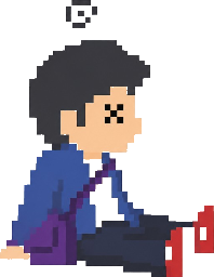
The product manager avatar was reduced to five states: Idle, Run A, Run B, Jump, and Dead. Run A and Run B reverse both the leading arms and legs while keeping the head and torso stable.
3.Separate artwork from gameplay geometry
The visual asset no longer determined the collision box. Player and obstacle dimensions live in the game’s logical coordinate system. Decorative pixels do not automatically become collision surfaces.
4.Make obstacles data-driven
Each obstacle follows a shared definition containing its asset, logical dimensions, hitbox, spawn weight, minimum score, animation behaviour, and enabled state.
5.Give the game the page
The final detailed page makes the playable area the primary interaction. Controls moved into the game’s HUD. The leaderboard and field guide moved below it.
The experience became an interactive product first and an explanatory case study second.
Separate the systems
Game engine
- Logical coordinates
- Jump physics
- Spawning
- Collision
- Scoring
Visual system
- Five avatar states
- Shared pixel palette
- Obstacle silhouettes
- Light and dark backgrounds
Product layer
- Pre-game state
- Field guide
- Leaderboard
- Score submission
- Responsive page layout
What I built
A product-themed endless runner
The core experience follows the Chrome Dino pattern but replaces desert hazards with product-development metaphors. Each obstacle has a distinct shape and gameplay profile. Low Tokens is low and wide. Bad Manager is tall and narrow. Tech Debt is an irregular mound. No Requirements is thin and upright.
A five-state pixel avatar
The player is a side-profile product manager carrying a messenger bag and running in casual professional clothing. All five states preserve the same character identity, palette, pixel scale, and orientation.
An infinite product-development landscape
The environment turns product artefacts into scenery: kanban boards, roadmap bars, metrics dashboards, release calendars, server stacks, milestones, and approval markers. The background is intentionally quieter than the player and obstacles.
Responsive logical scaling
The game uses a fixed internal world rather than recalculating physics from browser pixels. The entire stage scales proportionally across desktop, tablet, and mobile while preserving jump timing, proportions, ground alignment, collision boundaries, and spawn spacing.
A leaderboard and field guide
The leaderboard turns a short personal experiment into a replayable shared experience. The field guide explains the metaphors behind the hazards—partly because early playtesting without labels created questions like “Why did I die to a chair?”

Idle
Run A

Run B

Jump
Dead
Sprint hazards

No Requirements
Make it better.

Bad Manager
Quick sync?

P0 Request
Everything is urgent.
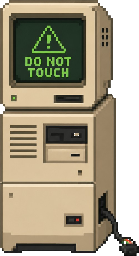
Legacy System
Do not touch.
Tech Debt
Temporary since 2019.


Low Tokens
2% remaining.

Reorg
Reporting lines in motion.

Stakeholder Feedback
Make it pop.

Scope Creep
One small addition.


Endless Alignment
Could this have been an email?
How I worked with AI
I used Cursor heavily for implementation, refactoring, debugging, and translating defined design rules into working components.
The productive pattern was:
- Define the behaviour.
- Define the visual contract.
- Define the file boundaries.
- Define acceptance criteria.
- Ask Cursor to implement the smallest coherent change.
- Test at actual gameplay size.
- Correct one system at a time.
The unproductive pattern was asking for mechanics, design, assets, responsiveness, and polish in one prompt.
The more ambiguous the request, the more likely Cursor was to rebuild a working system unnecessarily, modify physics while styling, generate inconsistent assets, solve layout problems with additional decoration, size entities from their source images, introduce breakpoints that changed gameplay behaviour, or mix visual styles between obstacles.
AI accelerated the work, but only after the project had stronger constraints.
The token reality
This was also a lesson in the cost of ambiguity.
By the time the visual system stabilized, I had used 82% of the first-party model allowance on my Cursor Pro plan.
Some of that usage produced useful implementation work. A meaningful portion came from revising broad prompts, generating visual directions that did not translate into gameplay, asking the model to repair symptoms rather than isolate the system, changing multiple layers of the game in the same request, repeatedly regenerating assets that lacked consistent dimensions, and using larger models for work that could have been handled by a narrower edit.
The most expensive part of the build was not writing the game loop. It was repeatedly resolving decisions that had not been made clearly enough before prompting.
My token-optimization rules became:
- Use a planning pass before coding.
- Separate mechanics, visual assets, and page layout.
- Name the exact files that may change.
- Prohibit unrelated rewrites.
- Test one representative asset before generating the full set.
- Use placeholders until the mechanics feel right.
- Provide fixed dimensions, baselines, and hitboxes.
- Attach one approved reference rather than several competing concepts.
- Stop asking the model to “make it better” without defining better.
The irony of creating a Low Tokens obstacle while consuming most of the plan allowance was not lost on me.
Low tokens
LOW TOKENS
First-party model usage
prompts remaining: emotionally limited
What I learned
AI works best after the product decision
Cursor could implement a stable sprite system, obstacle configuration, or responsive layout quickly. It could not decide what the game should prioritize as reliably as I could through playtesting and comparison.
Visual consistency is an interface contract
Every sprite state requires shared rules for dimensions, padding, baseline, visual centre, palette, layer order, and body proportions. Without those constraints, individually good assets create a bad animation.
Simplification can be technical strategy
Switching from detailed editorial vectors to block pixel art reduced asset complexity, rendering inconsistency, small-screen readability issues, collision ambiguity, and integration effort.
Responsive design should not alter the game
Keeping gameplay calculations in logical coordinates prevented physics and collision behaviour from drifting across screen sizes.
The game needed a theme, not more scenery
The product-board environment worked because it supported the metaphor without demanding attention.
Rebuilding can be cheaper than patching
Once the early version had accumulated inconsistent assets and competing layout assumptions, restarting from a simpler architecture was faster than continuing to repair it.
Key takeaway
Key takeaway
Product Sprint began as a small joke about product work and became an experiment in building with AI under real design constraints. The game is about jumping over Tech Debt, Scope Creep, P0 Requests, and Low Tokens. The build process involved most of the same obstacles.
What's next
The next iteration focuses on identity and replayability without changing the one-button loop.
Planned improvements include colour-only avatar customization, attaching the submitted avatar configuration to leaderboard scores, improved difficulty tuning, score milestones and lightweight sound cues, leaderboard moderation, additional obstacle combinations, and continued mobile playtesting.
Avatar customization will remain constrained to colour. The silhouette, clothing shapes, animation states, and collision geometry will stay fixed. When a player submits a score, the leaderboard will store a snapshot of the avatar used for that run.
Tech stack
- Next.js
- React
- TypeScript
- CSS pixel sprites
- requestAnimationFrame
- Supabase
- Vercel
- Cursor
Product Sprint began as a small joke about product work and became an experiment in building with AI under real design constraints.
Play Product SprintMore from the Playground
Experiment
Building my portfolio like a product
Designed, built, and shipped a personal portfolio using AI-assisted development—not as a static collection of work, but as a living product system.
Prototype
Calmo Cafe — a reservation flow that skips the early SaaS bill
I built a branded site and request-to-confirm booking flow for a friend opening a café in Toronto, both to keep him off OpenTable fees before the room was proven and to learn a real stack end to end.
Prototype
Joist Trust Sandbox
Voice-to-invoice for contractors — verified when matching is solid, amber review when it isn’t.