EXPERIMENTDESIGN PASSESAUG 2026
Calmo Cafe | making it look like the room
A follow-up on the Calmo build: why the visual pass took longer than the booking flow, and how I used ChatGPT, reference hunting, and Cursor to ping-pong toward something my friend would actually send to guests.
Overview
The first Calmo post is about the booking flow, the $0 stack, and why a new café should not pay for OpenTable before the room is proven.
This one is about the part I kept reopening in August: making the site look and feel like Calmo.
That sounds softer than auth, email, or admin states. It was not. The product worked early. The homepage still looked like a competent template that could belong to any brunch spot on Dundas West. My friend cared about vibe. I cared about clarity. We were both right, and we did not always mean the same thing by "nice."
The problem
Design is preferential in a way backend logic is not.
Two people can disagree on whether a hero feels warm or stock. Whether the menu section is readable or crowded. Whether the site looks premium or trying too hard. There is rarely a unit test for that.
For Calmo, the tension was sharper because I was designing for someone else's business, not my portfolio aesthetic. He wanted calm, local, and real. I kept reaching for layouts I had seen work elsewhere: big type, tight grids, the usual landing-page rhythm.
The first passes were fine. They were also interchangeable. You could swap the logo and plausibly call it a different café.
That is a risky place to stop when the whole point is helping a new operator look established before opening day.
First pass vs. now
The site at calmo-cafe.vercel.app today is not the site I shipped at the end of week one in June.
Early versions leaned on defaults: safe serif headlines, generic section spacing, hero copy that read like marketing filler, and photography treated as decoration instead of mood. The booking flow was already usable. The brand layer lagged behind.
Over August, the live site moved toward something that feels like the room:
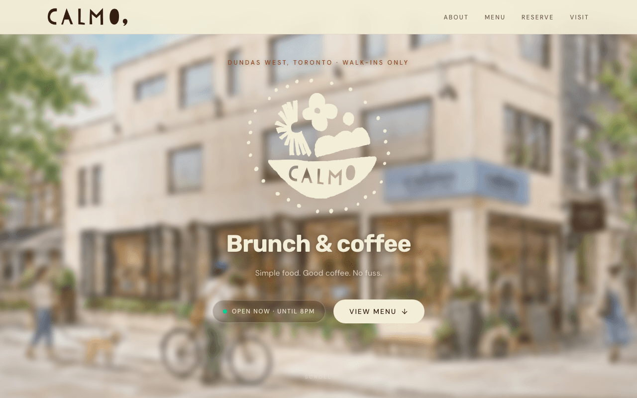
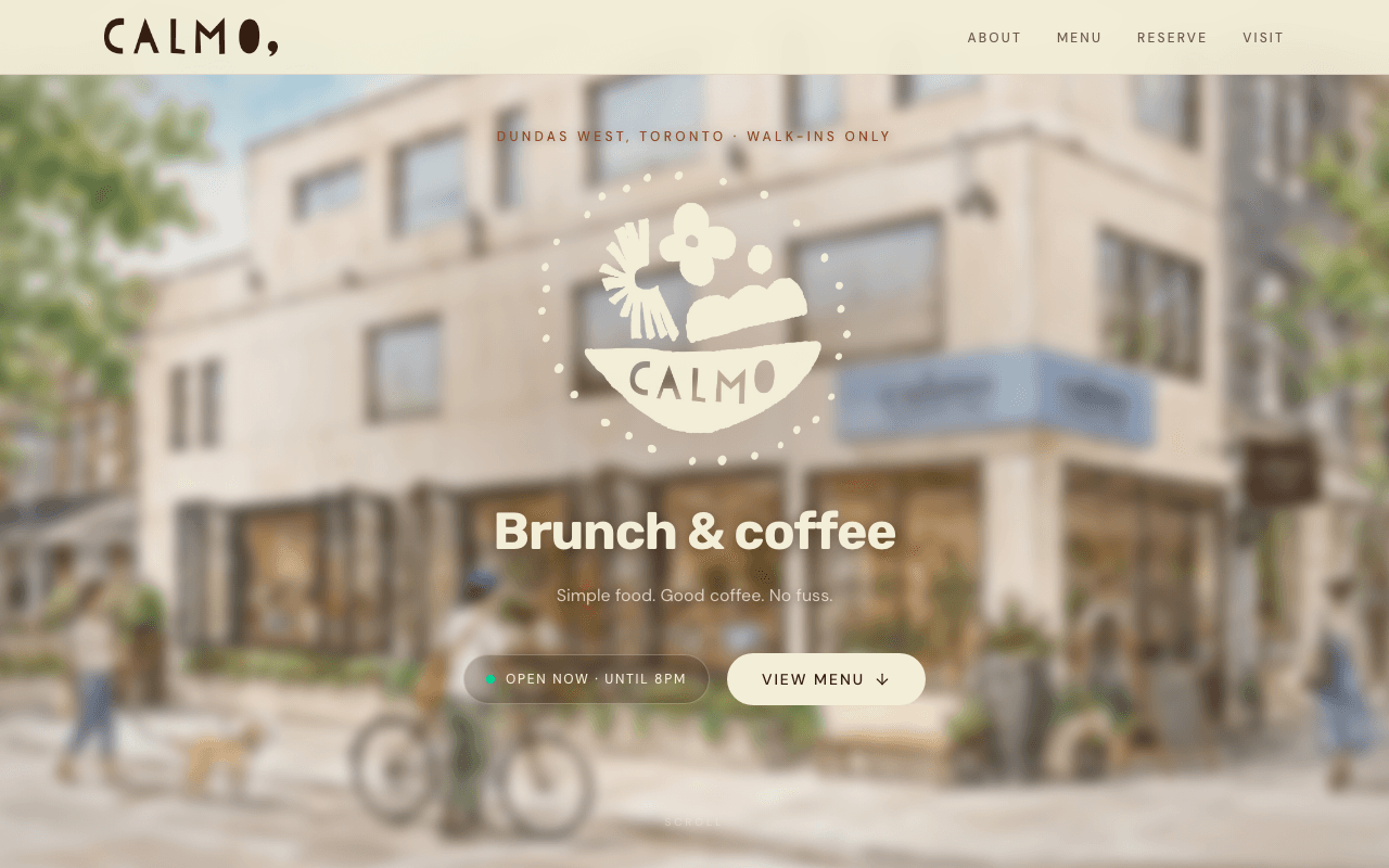
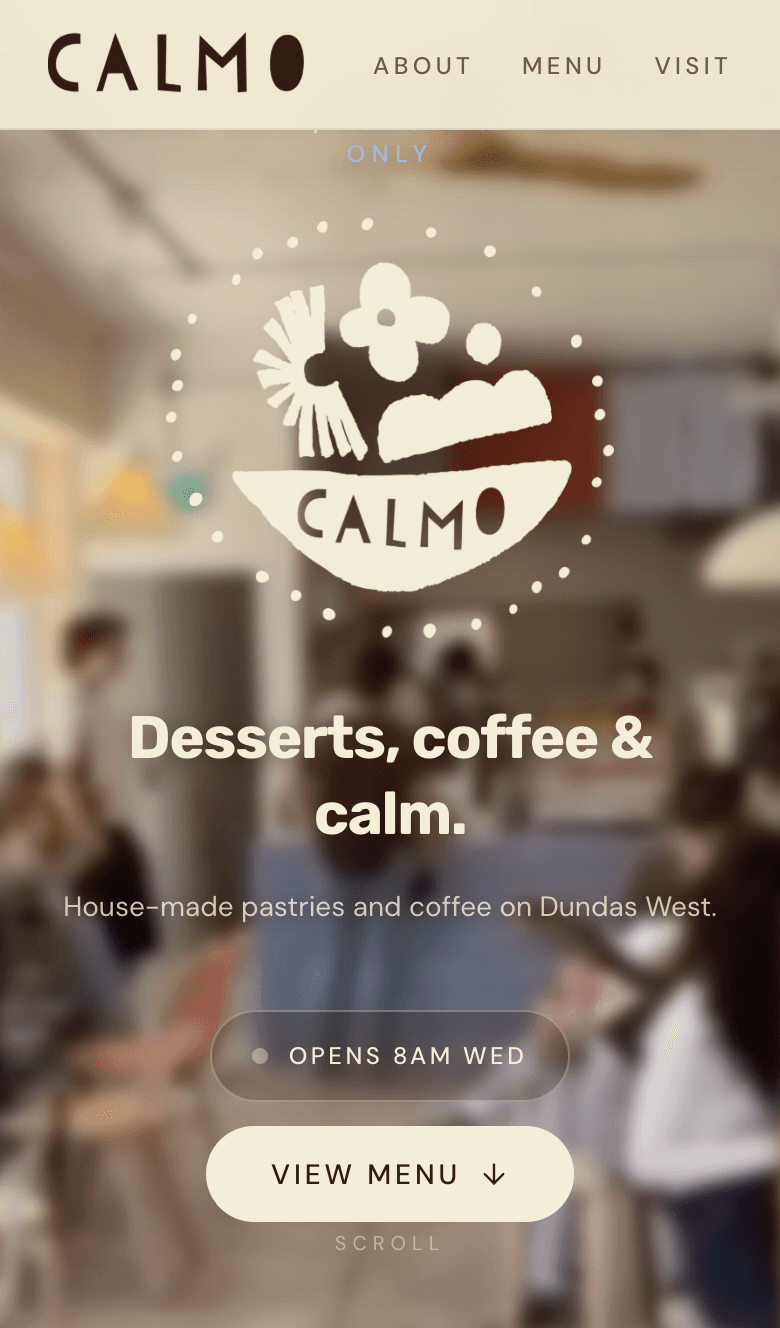
- A blurred interior hero with "Desserts, coffee & calm." instead of a stock café template
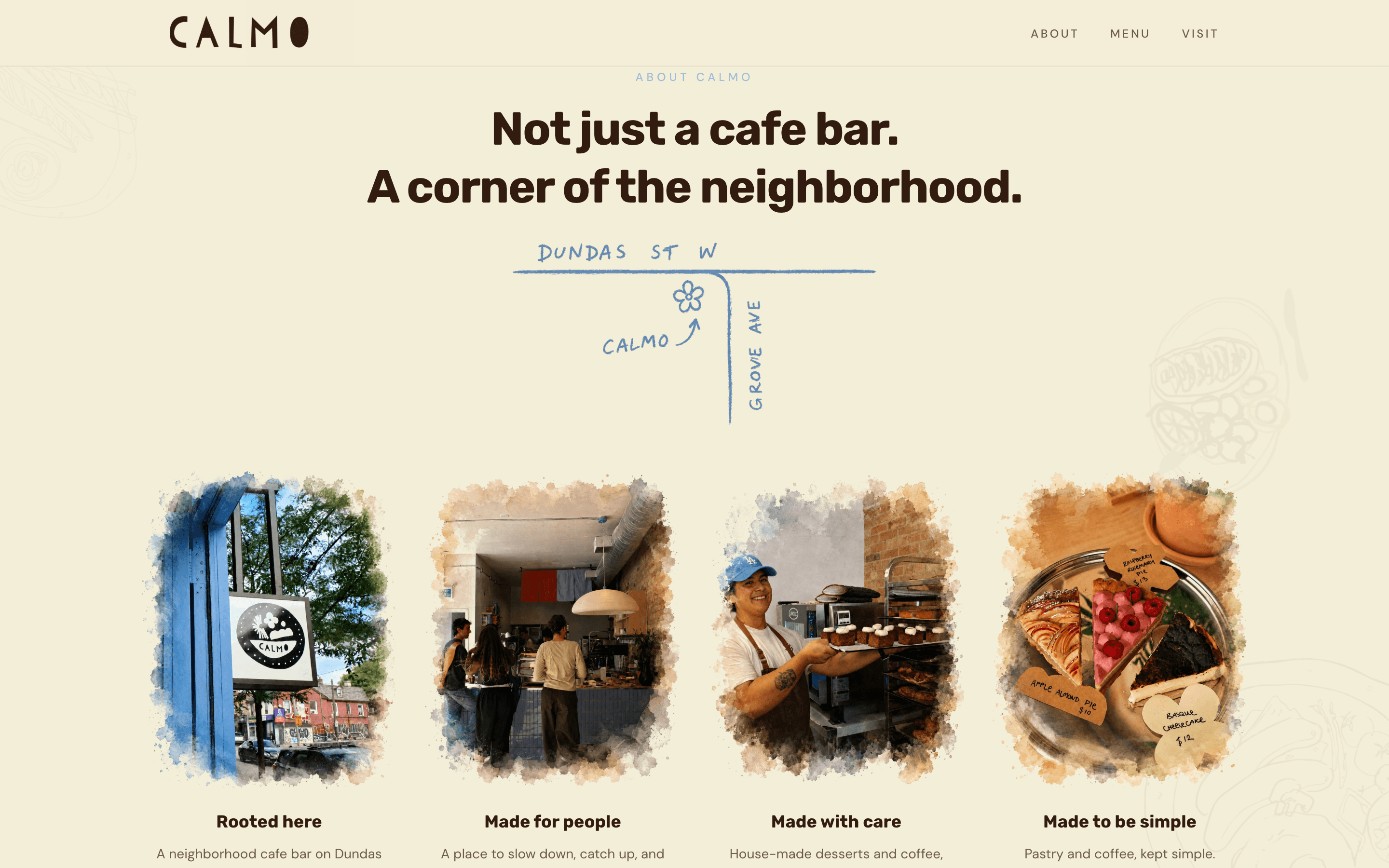
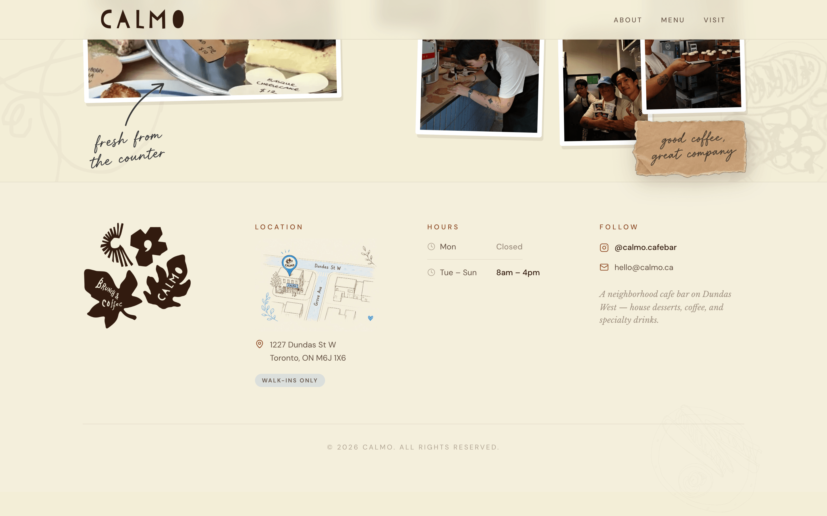
- A hand-drawn Dundas St W / Grove Ave map in the about section
- Watercolor-bordered photos in a four-column "corner of the neighborhood" grid
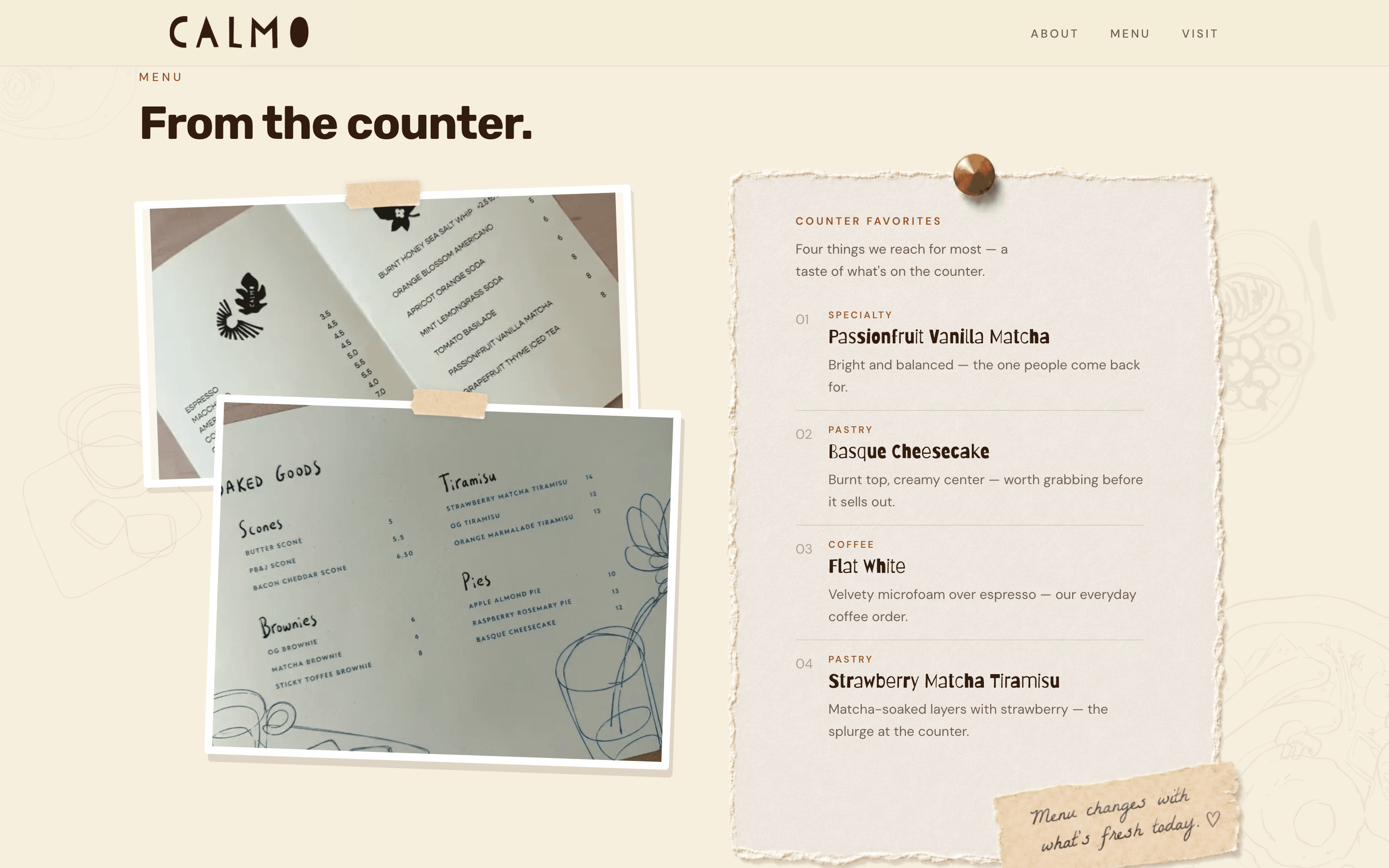
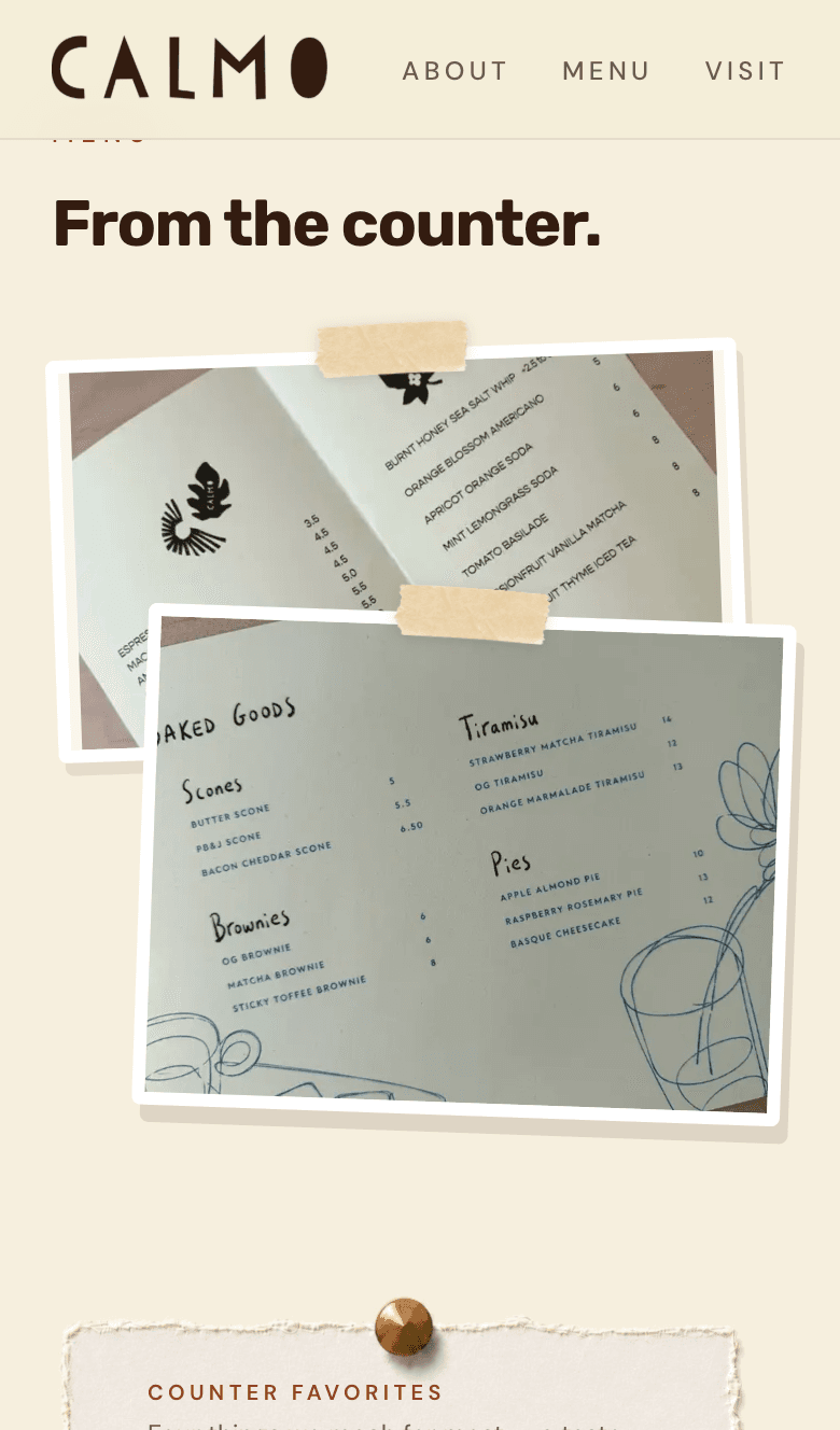
- A menu section built from taped counter photography and a pinned counter favorites sheet
- Walk-ins only messaging up front, once the public positioning settled
The June build note still uses the earlier previews, including the request-a-table flow from before this visual pass.
How I designed it
I am not a visual designer by trade. I did not open Figma for this project.
Most of the design work happened in a loop between three things:
1.ChatGPT for thinking out loud
I used GPT more than anything else: early copy, layout ideas, naming sections, and quick critique when I was stuck. "Does this hero feel too corporate?" "How would you simplify this menu block for mobile?" It was useful for getting unstuck, not for shipping final UI on its own.
2.The internet for references
I spent a lot of time scouring café sites, bakery pages, and UI galleries for patterns guests already understand: how menus are photographed, how hours are presented, how photography carries mood without feeling like a stock template.
One reference I kept coming back to was skiper-ui.com: not to copy it directly, but for layout rhythm, component density, and the feeling of something handmade rather than SaaS-polished.
3.Cursor to ping-pong concepts into code
Once I had a direction in words and screenshots, Cursor was how I turned it into something real. I would describe a change, ship it, react to it in the browser, and come back with a tighter prompt. Back and forth. Small passes, not one big redesign.
The workflow was reference hunting in the browser, thinking in GPT, building in Cursor, then showing my friend a screenshot before I trusted my own taste.
I was not trying to invent a new café aesthetic. I was trying to borrow structure from places that already work, then strip away anything that felt generic for Calmo.
Who gets a vote
I had to separate three questions that kept collapsing into one:
What does the business need?
Hours, location, menu, contact path. Non-negotiable.
What does the owner want guests to feel?
Calm, welcoming, not over-designed. His call carries more weight than mine.
What do I think looks good?
Useful, but not sufficient.
When those conflicted, I defaulted to legibility and trust over novelty. If I loved a layout and he found it cold, cold won. If he wanted something ornate and it hurt scanning on mobile, scanning won.
The useful habit was showing options quickly instead of defending one direction for a week. A screenshot in iMessage beats a paragraph about typography.
The live site
These captures are from calmo-cafe.vercel.app in August 2026, plus the June homepage for comparison.
The gallery below is the part I mean when I say the site finally started to feel like the café: softer hero, neighborhood about grid, taped menu collage, and walk-ins positioning on mobile.
When I stopped
There is always another pass: another font weight, another hero crop, another spacing tweak that might make the menu feel 5% more expensive.
I stopped when the site cleared a practical bar. My friend could send the link to family and investors without apologizing for it. The public site still made sense on mobile. Further polish was mostly me indulging taste rather than reducing risk for opening.
Pre-opening sites have a shelf life. The room will change. Photos will get better. The menu will move. Another week of micro-refinement would not have changed whether the café was ready to be seen.
I wrote this as a separate note because that stopping problem is its own lesson. It is easy to hide inside a build recap that makes everything sound inevitable.
What I learned
"Nice" needs an owner
On a favor build, that is the person opening the café, not the person running the prompts.
Subjectivity is not an excuse to avoid decisions
Someone has to pick the type, the crop, and the density. Endless optionality is delayed commitment.
Flows can be right while the brand is still wrong
Calmo reminded me to sequence the work: make it work, then make it feel like the place.
References help, but taste still has to land with the owner
skiper-ui.com and other café sites gave me patterns. They did not tell me whether my friend would like the result.
Design reviews get easier with artifacts, not adjectives
Send the screenshot. Open the phone. Point at the section that feels off.
Good enough for opening day is a real milestone
Perfect moves. Useful does not.
Key takeaway
Key takeaway
Making Calmo work was a product problem. Making it feel like Calmo was a judgment problem. GPT, reference sites like skiper-ui.com, and Cursor helped me iterate faster. None of them removed the need to pick a direction and show it to the person whose name is on the door.
What's next
If Calmo gets real foot traffic, the next design questions are operational: better photography from inside the room, seasonal menu updates on the taped counter boards, and whether the homepage should foreground walk-ins differently once there is a line out the door.
For the original build story (stack, booking states, admin), see the main Calmo Cafe note.
Tech stack
- ChatGPT
- Next.js
- Tailwind
- Cursor
- Vercel
Read the original Calmo build note for the reservation flow, admin tooling, and $0 stack.
Calmo build noteMore from the Playground
Prototype
Calmo Cafe | reservations, ordering, and café operations
A branded site and operator tooling for a Toronto café: table requests, whole-pie advance ordering, wholesale and event inquiries, pickup scheduling, and Square-friendly payment tradeoffs without enterprise reservation SaaS.
Experiment
Building my portfolio like a product
Designed, built, and shipped a personal portfolio with AI-assisted development, as a living product system rather than a static résumé archive.
Experiment
Building Product Sprint
How an over-scoped “Ship It” prototype became a focused pixel-art runner about surviving product chaos, and used 82% of my Cursor model allowance along the way.